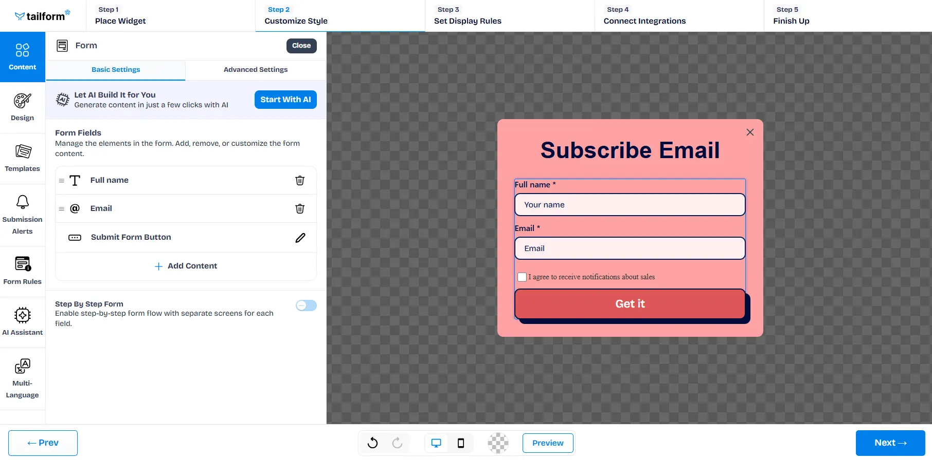
In the Form section under the Content tab, you can design your form layout and behavior to perfectly match your goals and design preferences.
Basic Settings:
Let AI Build Your Form: Use the “Start with AI” button to instantly create a fully-structured form using AI-powered smart suggestions.
Form Fields Management: Add, remove, or reorder form fields, for example:
First Name
Email Address
Phone Number
Submit Button
Step-by-Step Form: Toggle this on to split the form into multiple screens for a better user experience.
Advanced Settings
Take full control of your form's behavior and layout with the following advanced options:
Show Permission for Email: Add an email consent checkbox (e.g., “I agree to receive emails”). This helps you stay compliant with GDPR or other privacy regulations when collecting user data for marketing purposes.
Show Permission for Phone: Similar to the email permission, this adds a consent checkbox specifically for phone numbers, useful if you plan to send SMS marketing or follow-up calls.
Put Fields in a Row: Display multiple input fields side by side on the same line (e.g., First Name and Last Name), allowing for a more compact and visually streamlined form design.
Align to Center: Vertically centers the form content within the widget for a more balanced and aesthetically pleasing look—especially useful when the form is placed in the center of the screen or popup.
Fields Bottom Border: Toggle this option to add or remove the underline-style bottom borders for form fields. Turning this off results in a cleaner, borderless input design.
Hide Form Button: Remove the Submit button entirely. This is useful if the form is purely informational or you're triggering submission via another action or script.
Allow Submitting Same Emails: By default, the form may block duplicate email entries to prevent multiple submissions from the same user. Enabling this option allows repeat submissions from the same email address — helpful for contests, feedback loops, or returning users.
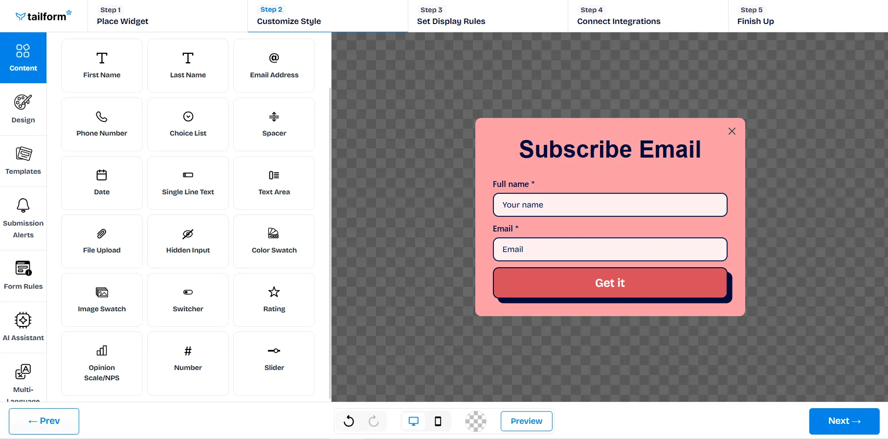
Form Content Customization
Inside the form field content editor, you can enhance your form using a rich selection of input types:
Standard Inputs:
First Name, Last Name, Email Address, Phone Number
Special Input Types:
Choice List (dropdowns or multi-select)
Date
Text Area or Single Line Text
Rating, and Opinion Scale/NPS
Image Swatch, Color Swatch
Advanced Elements:
File Upload
Hidden Inputs (for internal tracking or prefilled values)

.svg)