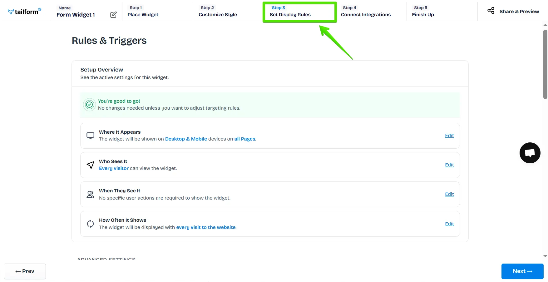
Once you are done customizing your widget, at Step 3, you can set up rules and condition options for your widget.
Let’s go through these sections:
Where It Appears
Who Sees It
When They See It
How Often It Shows
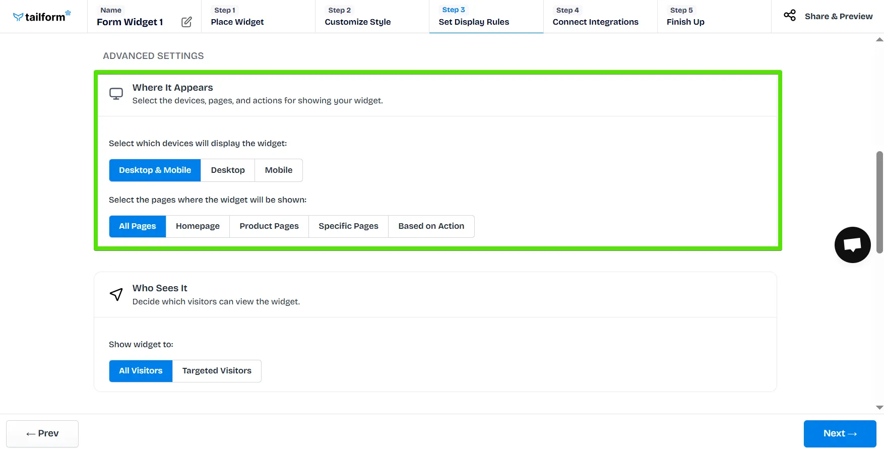
How to Use the Display Settings?
Where It Appears
Here, you can select the devices, pages, and actions that will trigger your widget display.
Device Selection
Desktop & Mobile – Display on all devices.
Desktop – Show only on desktop views.
Mobile – Show only on mobile devices.
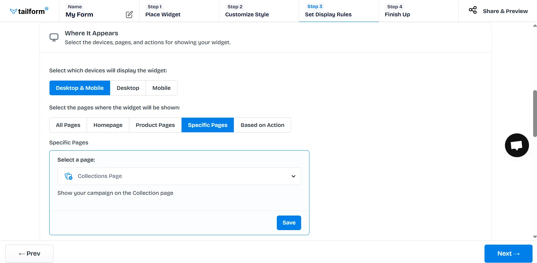
Page Selection (Specify the pages where your widget should appear)
All Pages – Display the widget across the entire site.
Homepage – Show only on the main page.
Product Pages – Display only on product detail pages.
Any Products – Show on all product pages.
Products – Select specific products manually.
Specific Pages – Choose individual pages
Targeted Page – Shows your widget on specific URLs. URL targeting trigger allows for displaying a widget when a URL link contains a specific parameter or equals a specific link.
Cart Page – Shows your widget on the Cart Page.
Collections Page –Shows your widget on the Collections Page.
Blog Page –Shows your widget on the Blog Page.
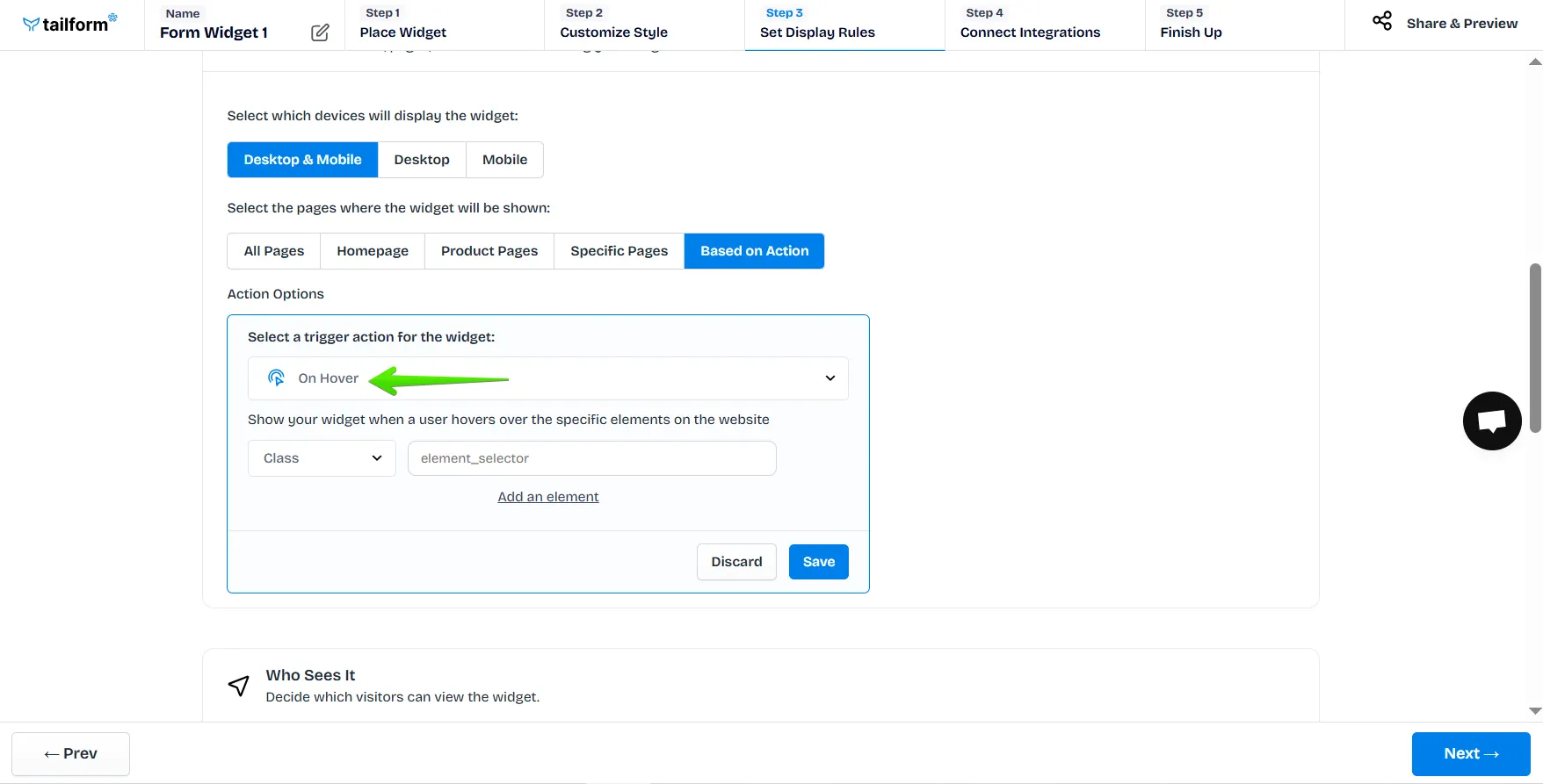
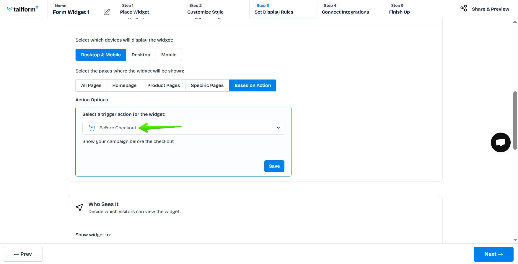
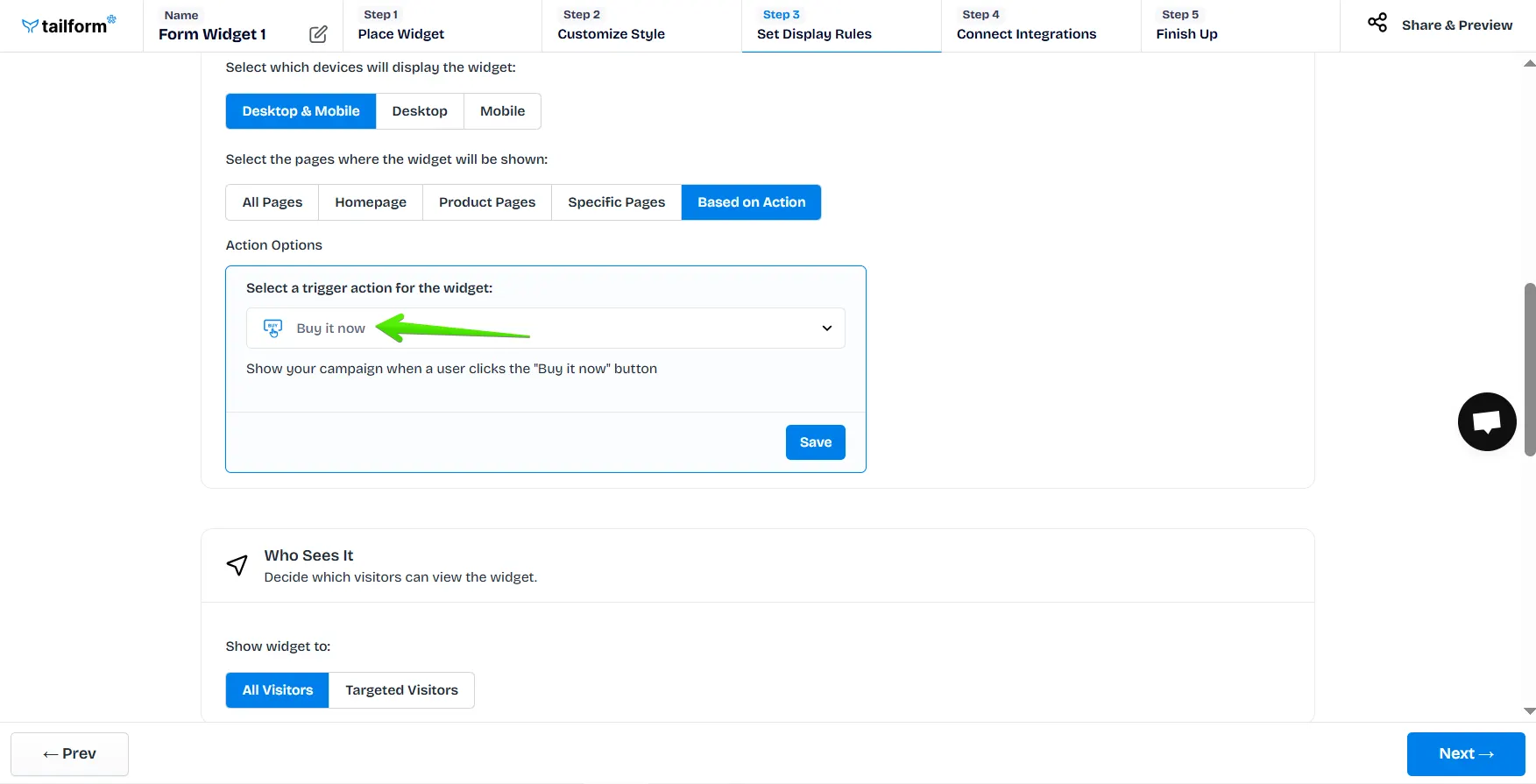
Based on Action – Trigger the widget by specific user actions:
Add to Cart: Add to Cart makes your widget appear after adding a product to the cart. You can choose to set it on all products, or pick the specific ones by clicking on “Select Products”.
Certain Button: A certain button makes your widget appear after clicking on a specific button. When selecting the Certain button, you need to choose one of the available options for this button’s settings:
Certain Button - A certain button makes your widget appear after clicking on a specific button. When selecting the Certain button, you need to choose one of the available options for this button’s settings:
Class - to define the button, input the unique class of the chosen button in the field;
Id - to define the button, input the ID of the chosen button in the field;
Code Snippet - to define the button, you can use “CSS selectors”, for example, input the button’s class with a dot or the button’s ID with a hash sign at the beginning of the field (.<class> or #<ID>).
Note: if the class or ID of the needed element is not unique, you can input the whole path to the needed element in the Code Snippet option.
On Hover: On Hover makes your widget appear after hovering over a specific element. When selecting the On Hover, you need to choose one of the available options from the settings:
Id - to define the element, input the ID of the element in the field;
Class - to define the element, input the unique class of the chosen element in the field;
Code Snippet - to define the element, you can use “CSS selectors”, for example, input the button’s class with a dot or the element’s ID with a hash sign at the beginning of the field (.<class> or #<ID>).
Note: if the class or ID of the neede element is not unique, you can input the whole path to the needed element in the Code Snippet option.
Before Checkout
Before Checkout trigger shows your widget before the checkout.
Buy it Now
Lastly, this one shows your widget when a user clicks on “Buy it now” button.


.svg)